Maria Lazareva
Writing about technology, product thinking and what I'm learning by building.
Conceptual UX case studies
Lloyds
vs
Barclays
vs
Barclays
Helping users make financial decisions confidently
How Lloyds and Barclays communicate ISA options to first-time investors.
Spotify
vs
TIDAL
vs
TIDAL
Winning (or losing) customers during free trial signup
How Spotify and Tidal communicate cost, commitment and cancellation.
Healthcare
patient
portal
patient
portal
Reducing patient uncertainty through clearer language
How minor changes in a healthcare portal can reduce confusion and support patients better.
Published work
GP Bullhound
Technology advisory and M&A
Led the editorial production of research and thought leadership content.
Geospatial Intelligence 2024
View PDF
Carbon Accounting Software 2024
View PDF
Technology Predictions 2024
View PDF

Latin America: An Emerging Tech Region 2023
View PDF
Technology Predictions 2023
View PDF
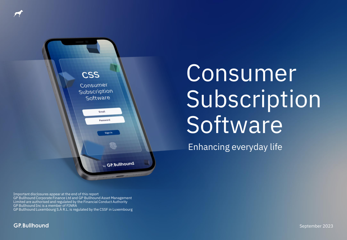
Consumer Subscription Software 2023
View PDF
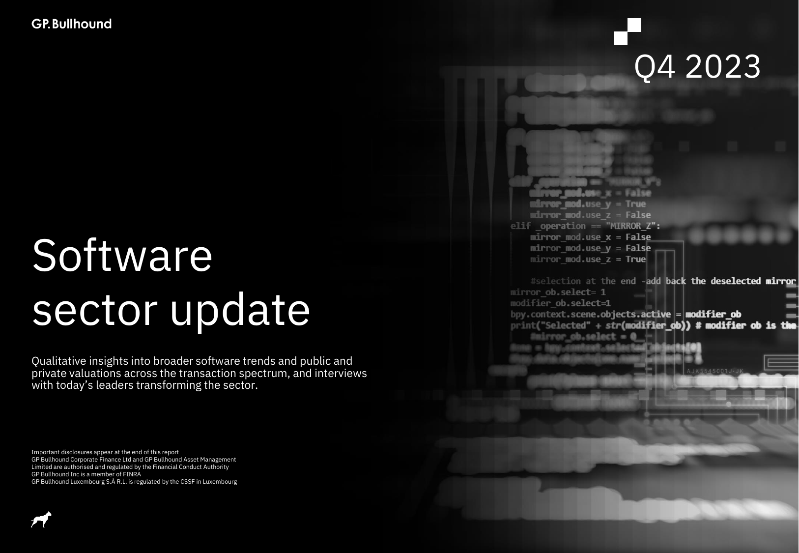
Software Q4 2023
View PDF
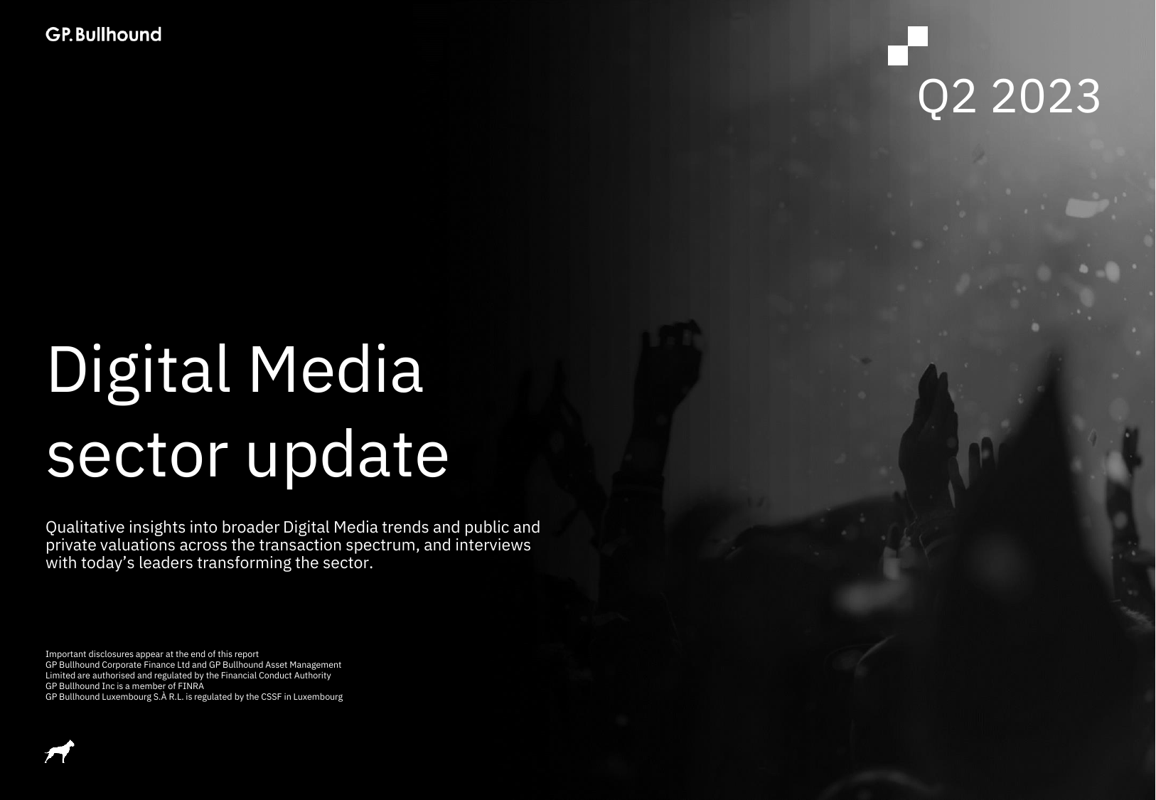
Digital Media Q2 2023
View PDF

Digital Services Q2 2023
View PDF

Digital Commerce Q2 2023
View PDF
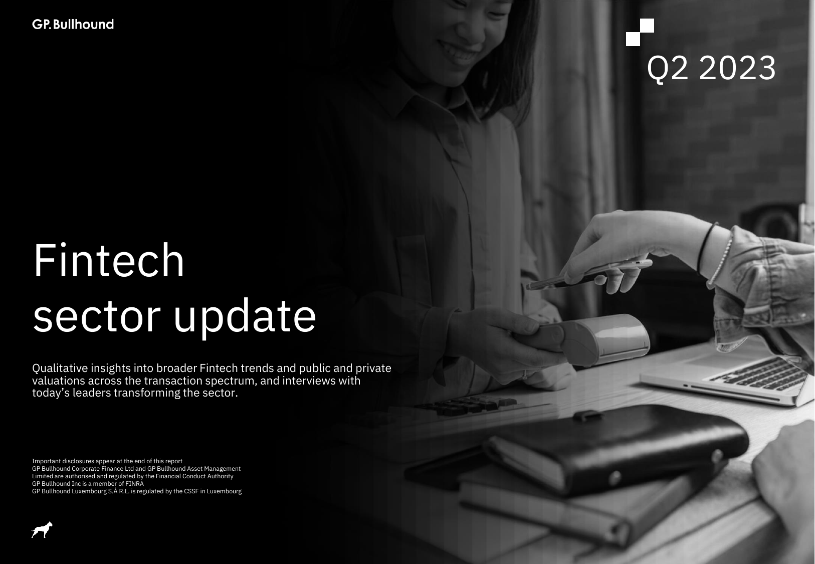
Fintech Q2 2023
View PDF
Education Technology 2022
View PDF
European SaaS Report 2022
View PDF
BeyondWords
AI audio and video platform for publishers
Transformed complex AI technology into user-centred content.
Audio articles: Tuning into the $16bn audio ad market
Read post
From metrics to mastery: Get better audio insights with BeyondWords Player analytics
Read post

The BeyondWords Player: Purpose-built for audio articles
Read post

Enhancing AI-generated audio articles with pronunciation rules
Read post
iWander
AI travel app for in-destination experiences
Developed product messaging, website content and in-app copy.
Media
Launched and produced an interview series with founders and CEOs, and a podcast covering public markets.