Designing clarity in healthcare portals: rewriting the patient experience
Healthcare portals aren't like other apps. People don't open them casually or out of curiosity. They usually arrive with questions, stress, uncertainty and a need for reassurance.
This case study looks at the UX writing in a private healthcare patient portal and analyses how content can either reduce confusion or add to it. The focus is not on visual design, branding or features, but on the words patients encounter at key moments: navigating the dashboard, finding support, understanding next steps and receiving confirmation after taking an action.
Side navigation
The side navigation is the patient's primary map of the portal. It shapes expectations of what they'll find and how to act. When labels are vague or operational, patients feel uncertain about whether they've missed something important — a feeling already amplified by their medical context.
Below is the current side navigation of the medical portal.
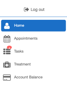
Three labels stand out as opportunities to write with more care: Tasks, Treatment and Account balance.
"Tasks" is one of the weakest labels. It sounds operational and administrative, as though the user is managing workflow items rather than navigating healthcare. Crucially, it creates uncertainty and carries emotional weight for stressed patients.
Users might wonder:
- Are these medical actions?
- Do I have forms to complete?
- Have I missed something?
- Does the clinic need something from me?
Patients are already in a heightened state and the labels should reduce mental load, not add unanswered questions.
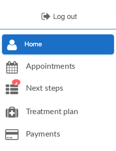
Proposal: "Next steps"
"Next steps" feels more supportive and suggests progression. It frames the section as guidance through their care journey rather than a to-do list.
"Treatment" is too broad. It lacks clarity because it doesn't tell users what they will actually find when they click into that section. Users are forced to interpret the meaning themselves, because "Treatment" could refer to medication, appointments, test results, care notes, instructions, history and more.
For users who arrive worried about a specific aspect of their care, an ambiguous label means more clicking and more uncertainty to arrive at the information they need.
Proposal: "Treatment plan"
Simply adding the word "plan" creates a more positive emotional effect because it implies thought, organisation and direction forward, which are qualities patients want to feel about their own care.
"Account balance" reads as banking or accounting language, not healthcare. It describes a status rather than an action, which feels misaligned with what patients actually do in this section — pay for their treatment, review charges, settle care fees.
Proposal: "Payments"
"Payments" is a more familiar and action-oriented term. Users are more likely to think "I need to make a payment" rather than "I need to check my account balance".
Proposed labels applied to the side navigation
Dashboard home screen
Let's look at the dashboard home screen and how it can be improved.
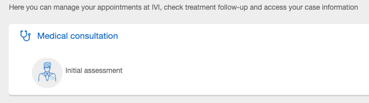
The current text is administrative and difficult to scan quickly. It describes internal healthcare processes rather than helping users understand what they can actually do.
Phrases like "treatment follow-up" and "case information" feel clinical and impersonal, while "Medical consultation" lacks clear direction. "Initial assessment" also gives no indication of whether the user needs to take action or whether the step has already been completed.
We want to use language that reduces interpretation and makes next steps obvious.
This line introduces too many concepts in one sentence. It also reads like an internal description of the system rather than something written for a patient arriving at the dashboard.
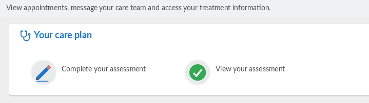
Proposal: "View appointments, message your care team and access your treatment information."
This version is clearer, shorter and more patient-focused than the original. Instead of describing internal processes, it tells users exactly what they can do inside the portal using familiar, action-oriented language.
"Consultation" suggests a one-off meeting, but the section actually contains everything tied to the patient's ongoing care: their assessment, plan and follow-ups. The label undersells what's there and could easily be mistaken for a link to book or join an appointment.
Proposal: "Your care plan"
This feels more patient-centred and aligns more closely with how patients think about their treatment journey.
The current label doesn't invite action, so patients need to click in to find out whether the assessment is completed or pending. This adds an unnecessary moment of uncertainty.
Proposal: "Complete your assessment" or "View your assessment"
If the assessment has not been completed, "Complete your assessment" is a clearer call to action. If it has been completed, "View your assessment" reassures the user that this step is done and reduces anxiety around wondering whether something is still pending.
Proposed copy applied to the dashboard home screen
Confirmation message
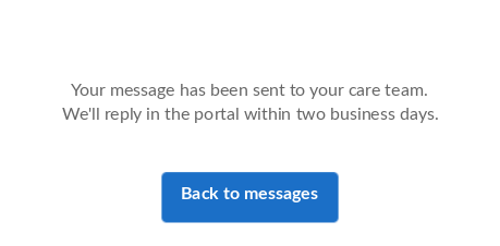
Once an enquiry is submitted, the confirmation page copy says: "We have received your enquiry. We will answer as soon as possible", with an "Accept" button underneath.
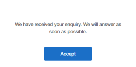
This confirmation message is vague, impersonal and does not properly reassure the user about what happens next. "As soon as possible" gives no meaningful expectation and can increase uncertainty. Users need a response timeframe and confirmation of next steps.
Proposal: "Your message has been sent to your care team. We'll reply in the portal within two business days."
This message is clearer and more human. Adding a response timeframe helps manage user expectations.
The "Accept" button is misleading. Is the user accepting terms, confirmation or responsibility?
Proposal: "Back to messages"
This improves clarity because the label now reflects the user's actual next action.
Proposed copy applied to the confirmation message