Helping users choose: how UX writing at Lloyds and Barclays shapes ISA choice
Lloyds organises ISA content around user goals. Barclays organises it around product types. When financial knowledge is low, goal-based framing reduces friction and supports better decisions.
Decision entry point
Lloyds introduces ISAs at the top of the homepage as a primary savings decision. Barclays introduces ISAs further down the homepage as part of a broader product offering. This difference signals two distinct writing strategies: one focused on guiding financial decisions, the other on presenting product options.
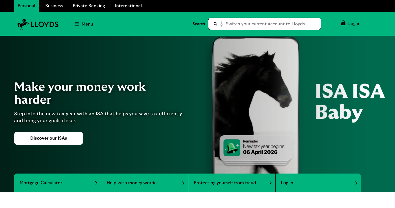
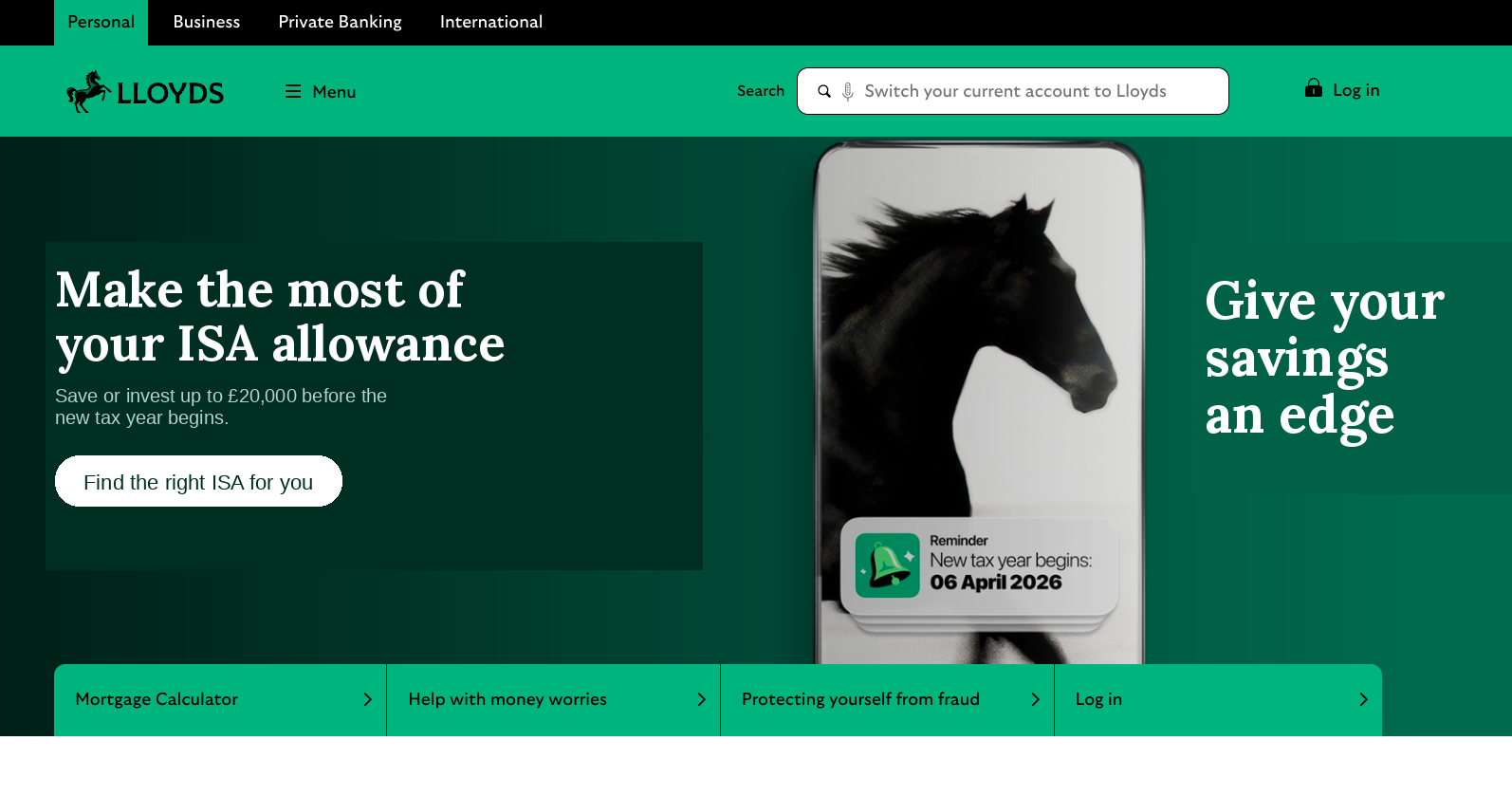
Makes the user feel in control of their money and signals financial benefit. But lacks specificity and a concrete outcome.
Proposal: "Make the most of your ISA allowance"
The revised headline improves product clarity by referencing the ISA allowance directly.
Sets the context and explains "why now". This is a good behavioural timing cue tied to tax year deadline. However, the copy can be improved with fewer words tied directly to the benefits.
Proposal: "Save or invest up to £20,000 before the new tax year begins."
The revised subheading adds a concrete action and deadline to strengthen motivation.
Offers learning before choosing and reduces pressure for users unfamiliar with ISA types. Could be stronger with a benefit-led action.
Proposal: "Find the right ISA for you"
Builds memorability and brand personality, but risks undermining trust for serious financial decisions. Brand voice is chosen over words that could offer more decision support.
Proposal: "Give your savings an edge"
The proposed text replaces playful brand copy with benefit-led language. The space here shouldn't contain primary product messaging but can still reinforce the idea of making a smarter financial decision.
Lloyds embeds the tax deadline in a familiar mobile notification instead of explaining it in text, reducing cognitive effort. But its low prominence means it can be missed, competing with louder copy like "ISA ISA Baby".
Proposed copy applied to the Lloyds homepage
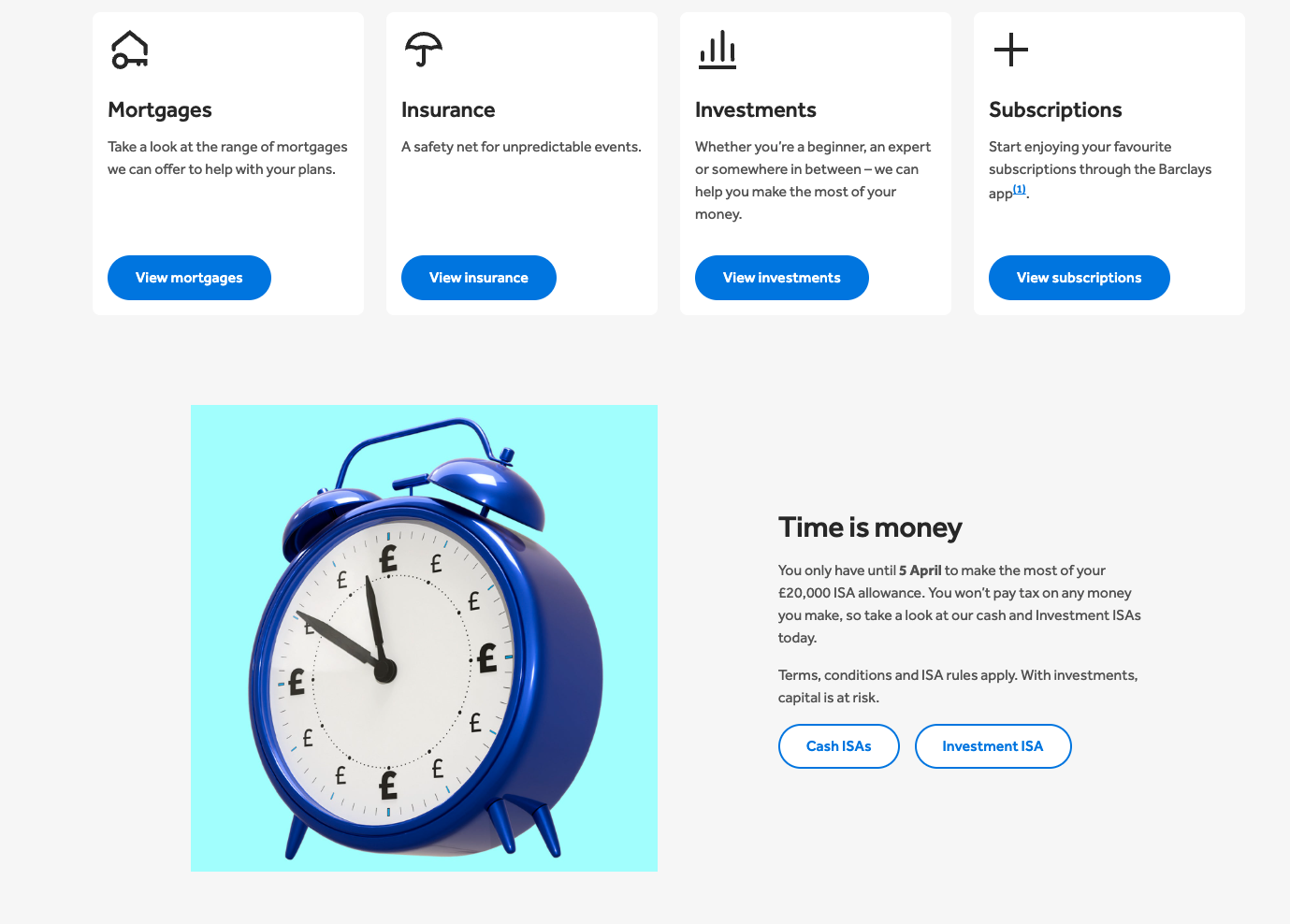
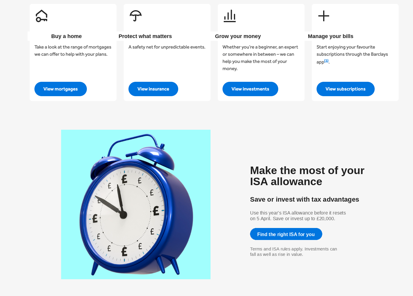
Barclays presents financial services as a catalogue rather than around user needs or goals. A potential change could be reframing categories around user intentions.
Proposal: Mortgages → "Buy a home" / Insurance → "Protect what matters" / Investments → "Grow your money" / Subscriptions → "Manage your bills"
A clear motivation driver that creates urgency. More of a psychological trigger than Lloyds' campaign-style "ISA ISA Baby" but is also a generic phrase.
Proposal: "Make the most of your ISA allowance"
This connects urgency to product. For a more campaign tone, but still credible: "Make this tax year count"
This copy jumps straight to allowance limits and tax rules, without explaining to users what an ISA is or why it matters to them specifically. While its aim is to provide information-first urgency, there's too much explanation while users are still deciding if they even want an ISA.
Proposal:
Headline: "Save or invest with tax advantages"
Support copy: "Use this year's ISA allowance before it resets on 5 April. Save or invest up to £20,000."
The new suggested copy explains to users why ISA matters and motivates them to act with urgency.
Legal copy placement adds friction prematurely – the users haven't even decided on an ISA yet.
Proposal: Move legal copy below CTAs and reduce prominence. Change to: "Terms and ISA rules apply. Investments can fall as well as rise in value."
Forces the users to choose a financial product before helping them understand what the difference is between Cash and Investment ISAs, and which one fits their needs. Users who are unsure are left without guidance.
Proposal: Replace "Cash ISA" / "Investment ISA" with: "Find the right ISA for you"
Add supporting text: "Compare cash and investment ISAs to see which fits your goals."
Proposed copy applied to the Barclays homepage
The Barclays user journey currently is:
We see the ISA promotion and are asked to choose: Cash ISA or Investment ISA. At this stage Barclays assumes we already understand the difference.
After clicking "Cash ISA", we are taken to a dedicated product page focused only on that option. At this point, the comparison context between a Cash ISA and an Investment ISA disappears.
Image of the product page
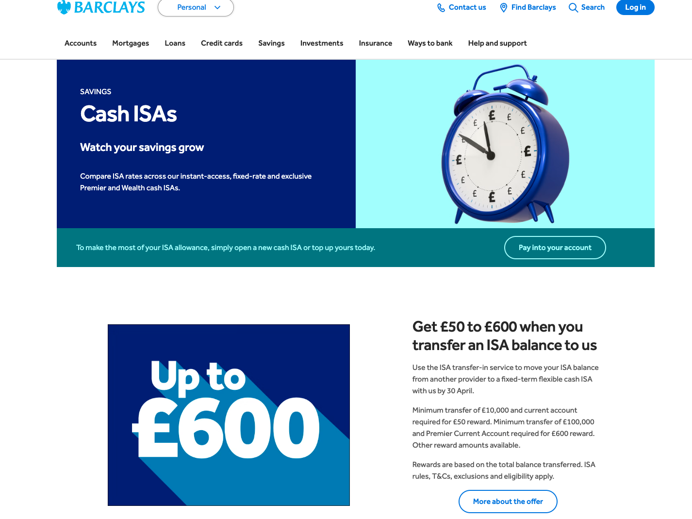
If we click back into the previous page, the original ISA comparison point is gone and replaced by promotional content about ISA balance transfers, which introduces a new concept entirely – something we have not yet encountered.
Image of the previous page
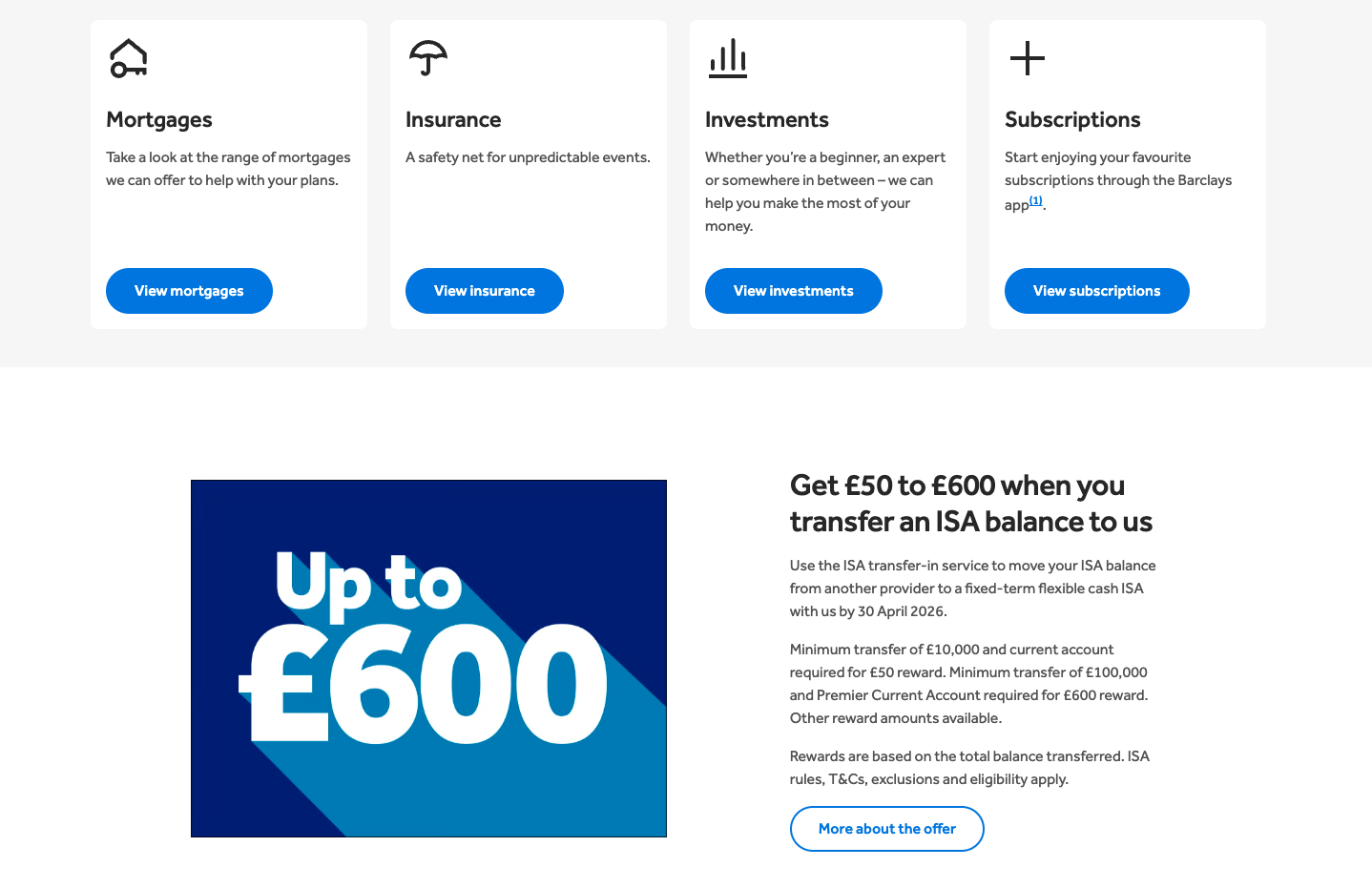
This creates several frictions: the comparison entry point is lost, the content shifts from decision support to marketing promotion, and we have to process new, unrelated financial terminology from scratch.
The user came back to compare ISAs but Barclays changed the topic.